PI Employee Experience Survey (DIAGNOSE)
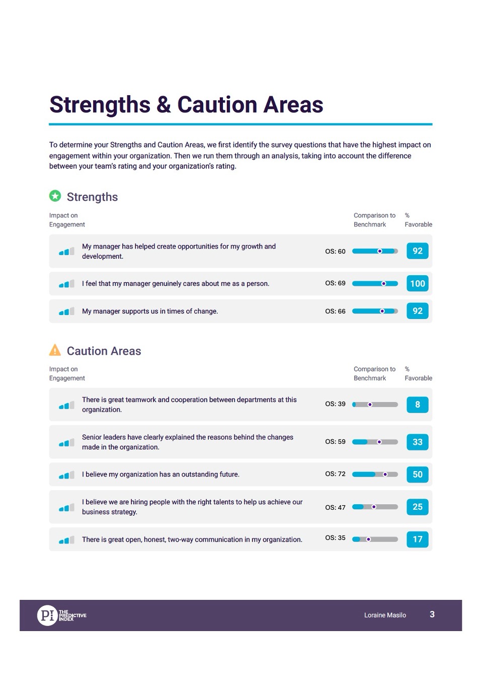
Comparison to Benchmark Scores in PI Employee Experience Survey - it is visually displayed via a Blue Bar and a Black Dot. Currently, only the "% Favorable" score is reflected. Clients are requesting that
the "Benchmark Score" should also be reflected as a number. This provides a reliable and accurate comparison, as the visual bar and dot are less specific, less precise.
Comments: 3
Oldest
•
Newest
•
Most likes
•
Fewest likes
-
28 Oct, '24
Anthony Walley MergedThe category reports contain a graphical (blue dot) indication of the benchmark for each question. Please could we add a numerical value?
-
13 Nov, '24
Joe Kirschbaum AdminThank you for the feedback. We have incorporated this approach with PI2, so that the benchmark score is highlighted as a number, as well as a line plotted on the visual bar. A screenshot is included for review.
-
13 Nov, '24
Joe Kirschbaum Admin"Add benchmark numerical score to each question in category reports" (suggested by <Hidden> on 2024-10-28), including upvotes (1) and comments (0), was merged into this suggestion.
